The quote, “The map is not the territory,” demonstrates a profound thought, and also a useful prompt for the TOK class. Before getting into connections between the quote and idea of models and metaphors, I wanted to put together a lesson on NYC subway maps (my school is in NYC). While doing so, I came across a bunch of different, and lovely, maps, each with its own representation of “reality.”
Download handout: NYC Map Handout
Click each image for a full size file.
1. Modern Day Subway Map
This is the map you see posted on the trains and subway platforms.

2. “Accurate Subway Map”
This map includes more accurate representations of distance and other features. Notice also it is more accurately oriented according to a traditional North-South map axis. The one above unintentionally (intentionally?) reorients the map around Manhattan.

3. NYC Station Map
This map focuses on the subway lines themselves and erases all other features.

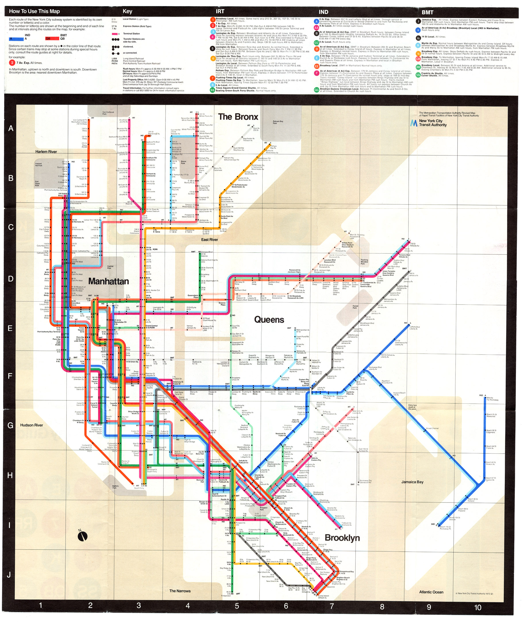
4. 1972 Massimo Vignelli Map
Much has been written about this map and the response it got. It put into practice the design principles (started in the London Underground Map designed by Harry C. Beck) that are used in many of the world’s systems. This map, though, did not receive a particularly positive reaction and was soon abandoned.

This site will morph the subway map into the actual geographic map for various metros around the world including New York. Really cool.
https://mymodernmet.com/animated-subway-maps/?fbclid=IwAR2VCceyzXgFTSM4SqN4NcyCymPBxjqzbmXAi4_Rxj2k59omfiD5nDFKLfg
If you’re interested in this topic, you can find a lot more maps and more information at: https://www.nycsubway.org/wiki/New_York_City_Subway_Track_Maps (Click on the “Maps” tab at the top of that page).


 The initiator of these observations was the Polish-American scholar Alfred Korybski. He most likely influenced Magritte’s art. Korzybski said “The Map is Not the Territory”. What he means is that the territory is the world and the map a generalization we use to make sense of it. It also proposes that we don’t have unmediated contact with the external world/reality (Expand your World). Korybski saw that language was at the same time the thing that made possible cultural development of the human race and at the same time the one that harmed it’s perception (Expand your World). When we communicate an experience, we often use generalizations in our words, and those generalizations leave out the things that made that event unique; they leave out the concrete experience, which results in a small abstraction of things out of a whole.