How maps confirm anti-migrant bias

‘Battlefield maps’ show continent under attack from hostile invaders.

See, maps have a problem. They appear neutral, objective, authoritative. But that’s exactly all that they’re not. Each map reflects the many choices the cartographer has made, consciously or not, both in terms of content and form.

And so, without us even noticing it, maps can confirm bias, entrench prejudice and perpetuate injustice.

https://bigthink.com/strange-maps/migrant-maps-confirm-bias

How Black Holes are Like Sea Monsters at the Edge of Our Vision

Covers a lot of good TOK ground.

How can we grasp nature’s image and put it on a page? How do we judge the truthiness of images of nature? These questions are particularly challenging when it comes to images of the far reaches of galactic and oceanic space, which share a quality that we might call sensory distance…Visualising places of sensory distance requires distinctive approaches, not merely to collect information but also to interpret it, since the information gathered is patchy. In the absence of comprehensive and accessible information, acquiring knowledge about sea monsters and black holes calls for imaginative image-making…

Although today’s black hole image emerges out of different material technologies, it, too, relies on techniques of imaginative prototyping of distant objects – about which only limited evidence can be gathered, by circuitous means – and collaborative practices of visualising…

Natural objects exist in the world independently of our knowledge of them and – what is key here – independently of any particular community’s knowledge of them…

The imaginative extrapolation involved in prediction and expectation is also crucial to the discovery of black holes: the laws of gravity suggested that this species of space entity existed, in theory, long before the first black hole was discovered in 1971. Just as naturalists had to imagine the animal whose head had once sported a tusk…

https://aeon.co/essays/how-black-holes-are-like-sea-monsters-at-the-edge-of-our-vision


How to Detect the Distortions of Maps

Every map is infused with its maker’s decisions, which ultimately present a pattern, story or argument. Sometimes those choices of design, labeling, data selection, and data slicing show up as obvious biases, as in the case of Donald Trump’s infamously augmented 2019 map of Hurricane Dorian. More often, though, this inherent “truthiness” flies under the radar of a map’s tidy, matter-of-fact visual presentation, as in the many maps and models being made now of semi-reliable Covid-19 case data.

So while it’s relatively easy to make a map in an age of abundant data and digital tools, it isn’t always easy to read them. How can you tell what’s real, and what’s a distortion?

https://www.citylab.com/design/2020/05/map-history-data-literacy-propaganda-exhibit-bending-lines/612157/

Link to the museum exhibit referred to in the article linked below

Screen Shot 2020-06-05 at 6.55.52 PM

https://www.leventhalmap.org/digital-exhibitions/bending-lines/


“The map is not the territory” especially with NYC Subway maps

The quote, “The map is not the territory,” demonstrates a profound thought, and also a useful prompt for the TOK class. Before getting into connections between the quote and idea of models and metaphors, I wanted to put together a lesson on NYC subway maps (my school is in NYC). While doing so, I came across a bunch of different, and lovely, maps, each with its own representation of “reality.”

Download handout: NYC Map Handout

Click each image for a full size file.

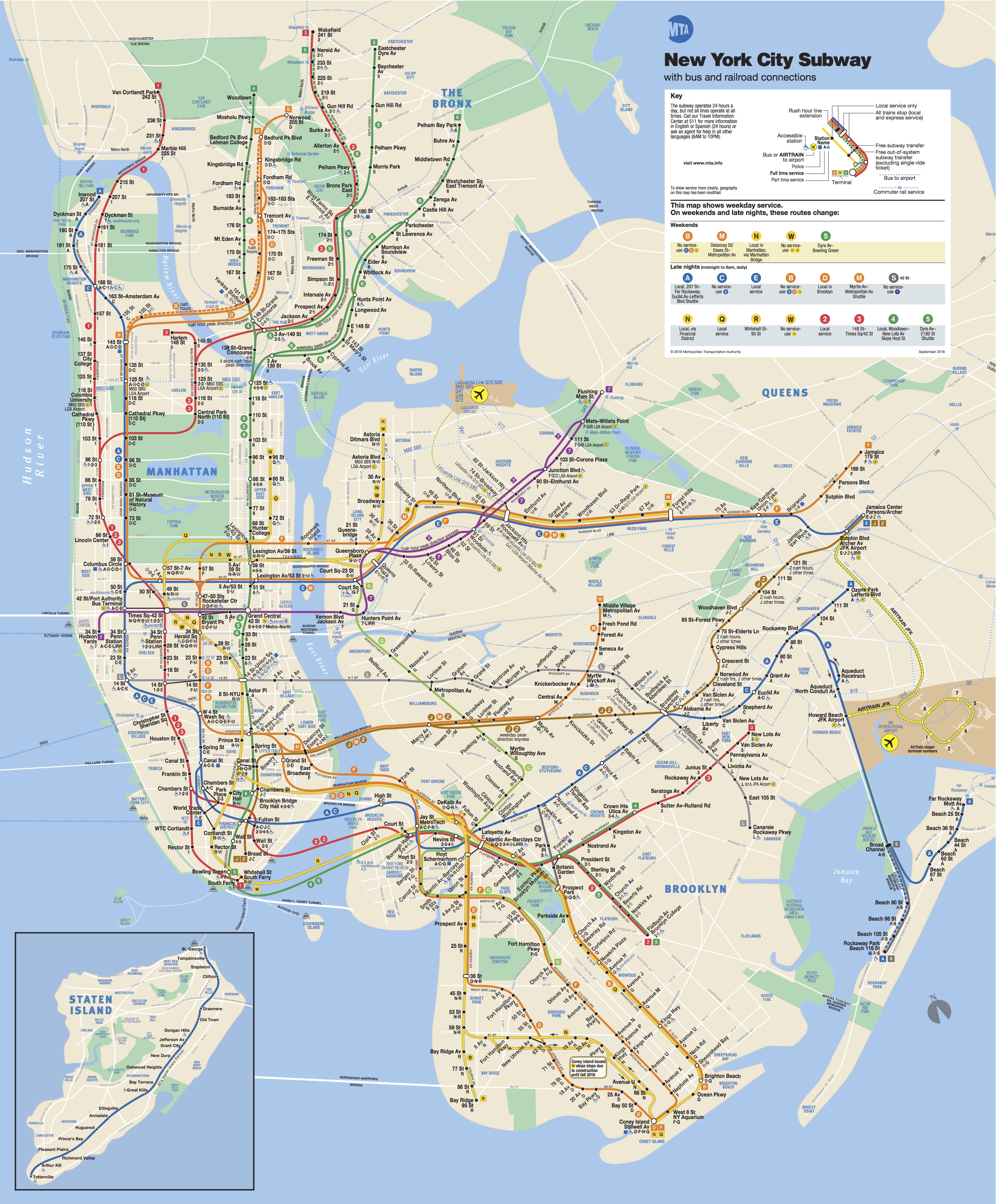
1. Modern Day Subway Map

This is the map you see posted on the trains and subway platforms.

modern subway_map copy

2. “Accurate Subway Map”

This map includes more accurate representations of distance and other features. Notice also it is more accurately oriented according to a traditional North-South map axis. The one above unintentionally (intentionally?) reorients the map around Manhattan.
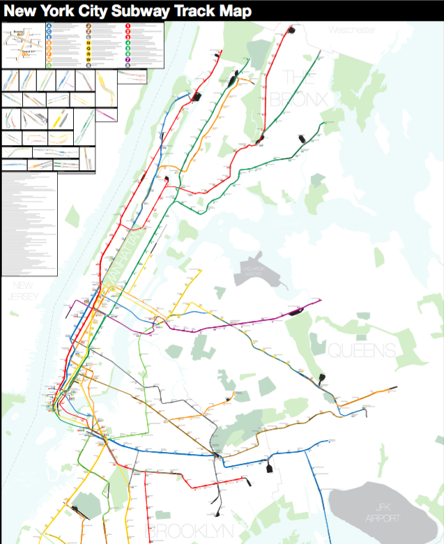
Screen Shot 2018-09-10 at 7.03.59 PM

3. NYC Station Map

This map focuses on the subway lines themselves and erases all other features.

 472stations-850miles

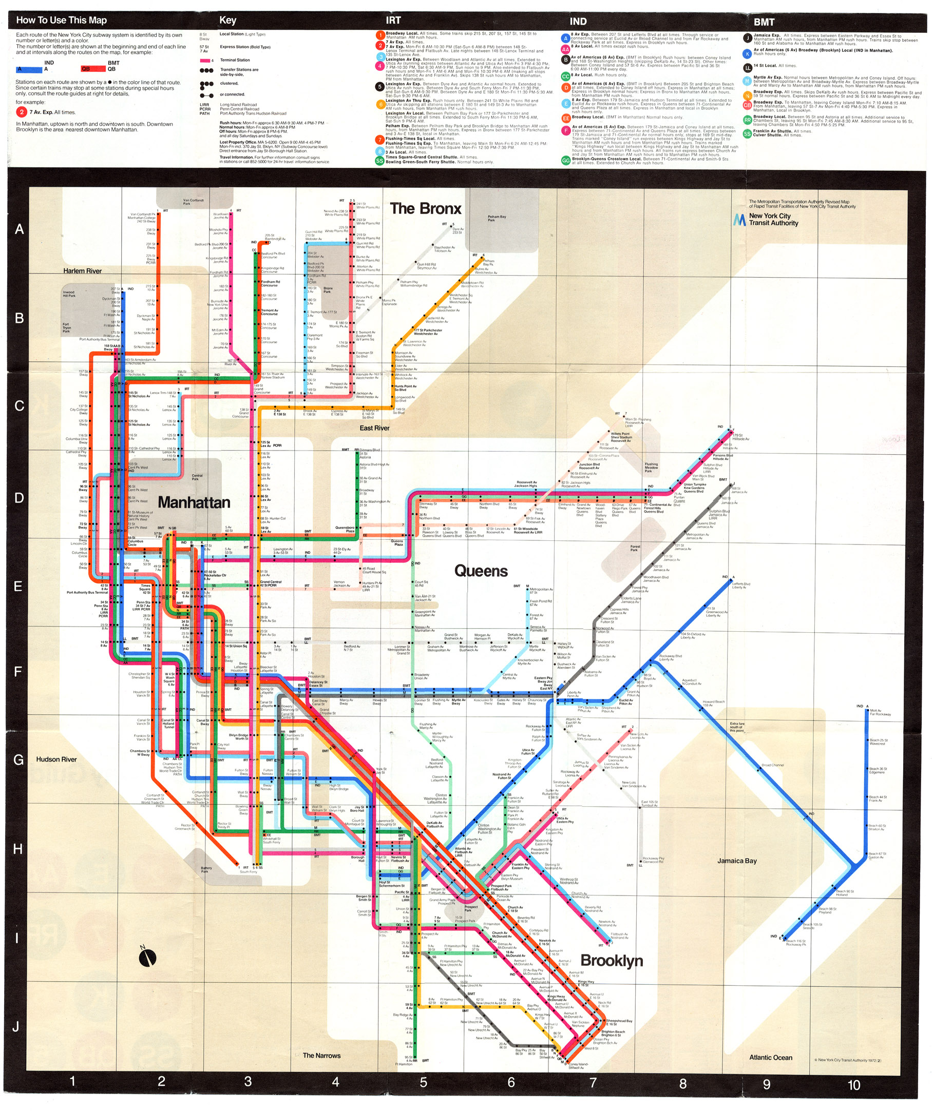
4. 1972 Massimo Vignelli Map

Much has been written about this map and the response it got. It put into practice the design principles (started in the London Underground Map designed by Harry C. Beck) that are used in many of the world’s systems. This map, though, did not receive a particularly positive reaction and was soon abandoned.

system_1972

This site will morph the subway map into the actual geographic map for various metros around the world including New York. Really cool.

https://mymodernmet.com/animated-subway-maps/?fbclid=IwAR2VCceyzXgFTSM4SqN4NcyCymPBxjqzbmXAi4_Rxj2k59omfiD5nDFKLfg

If you’re interested in this topic, you can find a lot more maps and more information at: https://www.nycsubway.org/wiki/New_York_City_Subway_Track_Maps  (Click on the “Maps” tab at the top of that page).

A Map of Lexical Distances Between Europe’s Languages

lexical-distance-among-the-languages-of-europe-2-1-mid-size

How does this visual representation give us a different sense of meaning than a traditional map?

“This linguistic map paints an alternative map of Europe, displaying the language families that populate the continent, and the lexical distance between the languages. The closer that distance, the more words they have in common. The further the distance, the harder the mutual comprehension.

“The map shows the language families that cover the continent: large, familiar ones like Germanic, Italic-Romance and Slavic; smaller ones like Celtic, Baltic and Uralic; outliers like Semitic and Turkic; and isolates – orphan languages, without a family: Albanian and Greek.”

http://bigthink.com/strange-maps/a-map-of-lexical-distances-between-europes-languages

Here is a site with some additional posts and discussions of related issues by the creator of this image.

https://alternativetransport.wordpress.com/category/linguistics/

All maps are wrong. I cut open a globe to show why.

“Maps are flat representations of our spherical planet. I cut open a plastic globe to understand just what it takes to turn a sphere into something flat:”

http://www.vox.com/world/2016/12/2/13817712/map-projection-mercator-globe?utm_source=Premium+TOK+newsletter+subscribers&utm_campaign=d8aa291c26-EMAIL_CAMPAIGN_2017_01_06&utm_medium=email&utm_term=0_f031581d64-d8aa291c26-98485421&mc_cid=d8aa291c26&mc_eid=34e2887073


Maps have North at the top, but it could have been different

p03yc9fk.jpg“Why are almost all modern maps the same way up? Caroline Williams explores the intriguing history that led to this orientation – and discovers why it shapes how we see the world in more ways than we realise.”

‘Map: Exploring the World,’ ‘The Curious Map Book’ and More

“What is it about maps that we find so fascinating? Ever since the Babylonians scratched two parallel lines and a circle — representing the Euphrates River and their walled capital — on a clay tablet almost 3,000 years ago, we humans have been producing flat spatial imagery to locate our place in the world. Maps anchor us, give coherence to our environment, help make visual sense of otherwise intangible realities. The most skillfully done maps, moreover, can be thrilling to look at, elevating cartography into art.”

http://mobile.nytimes.com/2015/12/06/books/review/map-exploring-the-world-the-curious-map-book-and-more.html?smid=tw-nytbooks&smtyp=cur&_r=1&referer=https://t.co/CyIJpyNFrJ


NAVIGATING BY FEEL: Polynesian Maps and Navigation

Polynesian Maps

“The Polynesians, scattered as they are over islands across the central and southern Pacific Ocean, are master navigators who tracked their way over a huge expanses of ocean without any of the complex mechanical aids we associate with sea navigation. They didn’t have the astrolabe or the sextant, the compass or the chronometer. They did however have aids of a sort, which though seemingly humble, were in fact the repositories of an extremely complex kind of knowledge. They are called Rebbelibs, Medos. and Mattangs.”

http://kurungabaa.net/2010/07/12/navigating-by-touch/

Below is a documentary about the Polynesians as well.